[vc_row][vc_column][vc_column_text]OOH reports 7.7 percent growth last quarter. Movies report a high-water summer box office of $3.2B. Streaming services are exploding. Content is coming at us from all directions. It’s all good. Very good.
While the exhibitors seek to create immersive theatrical experiences to lure you out of the house, there’s often nothing better than taking in all this terrific, fresh, and easily available content in the comfort of your own home. The options are abundant, and it’s a buyer’s market. We, the viewers, have choices. A constant flow we can never hope to keep up with.
Yet in the end, the content machines need an audience, and the audience is hungry for more. OOH stands at the ready as the elixir. We are the analog messenger for the never-ending supply of digital content. We are where you go when you want to reach everyone right now. We are the voice of the cities we serve.
What follows are 17 examples of what caught my eye this summer in LA. It’s not everything. It’s what I liked and why. Hope you enjoy the reviews and get a feel for what it was like on the OOH streets in the city of angels this past summer.[/vc_column_text][/vc_column][/vc_row][vc_row][vc_column][vc_column_text]Once Upon a Time in Hollywood (Columbia)
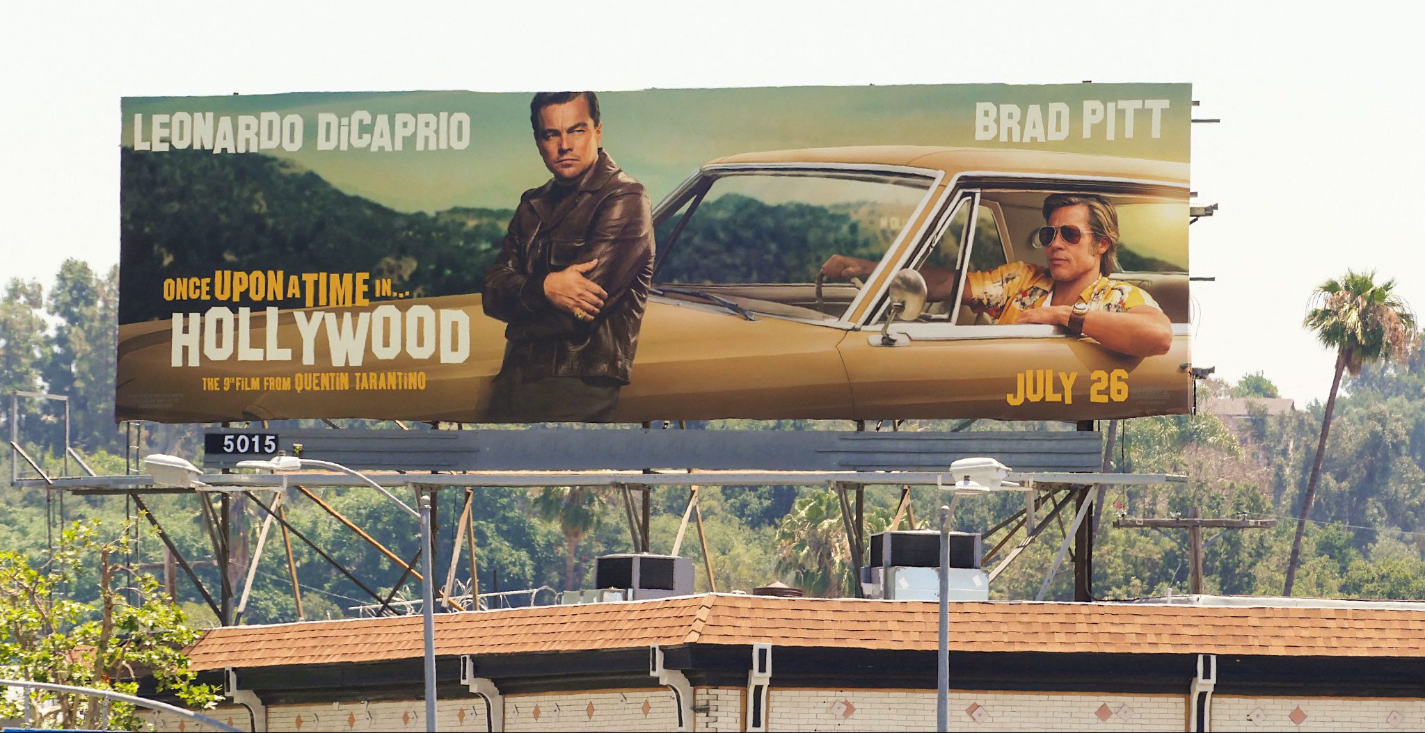
This magnum opus to Hollywood literally stole the show on the Sunset Strip. Much like the multi-connected-yet-disjointed narratives Quentin Tarantino is known to spin in his films, this OOH effort wrote its story with large and small format placements, contextual moments, epic neon, and other surprises – all while crafting a tightly woven fabric of unique creative messages slowly revealing an outstanding ensemble cast. From The Whiskey a Go Go to The Chateau Marmont, this unfolding OOH drama delivered a brilliant and welcomed daily addition to the living dialogue between Angelinos and our movie makers.


[/vc_column_text][/vc_column][/vc_row][vc_row][vc_column width=”1/3″][vc_single_image image=”2041″ img_size=”large” onclick=”img_link_large”][/vc_column][vc_column width=”1/3″][vc_single_image image=”2012″ img_size=”large” onclick=”img_link_large”][/vc_column][vc_column width=”1/3″][vc_single_image image=”2040″ img_size=”large” onclick=”img_link_large”][/vc_column][/vc_row][vc_row][vc_column width=”1/2″][vc_column_text]Aladdin (Disney)
This is classic! Clean, balanced, three elements, a dominant visual, good contrast; all the necessities for a strong piece of OOH creative. There’s also a commitment – an underlying confidence in the promise of a genie in a bottle – deftly executed with a playful touch of wistful smoke teasing our intrigue about what’s inside…
 [/vc_column_text][/vc_column][vc_column width=”1/2″][vc_single_image image=”2046″ img_size=”large” onclick=”img_link_large”][/vc_column][/vc_row][vc_row][vc_column width=”1/2″][vc_single_image image=”2047″ img_size=”large” onclick=”img_link_large”][/vc_column][vc_column width=”1/2″][vc_column_text]Annabelle (New Line)
Is this surprise and delight? – or surprise, startle, and make my skin crawl? At first glance we see a very typical movie poster with a strong title treatment, customary subhead, release date, and a little too much copy. Then, just when we’ve dismissed it as a pedestrian effort, we double take and catch the creepy eyes of the haunted doll poised to wreak havoc…
 [/vc_column_text][/vc_column][/vc_row][vc_row][vc_column width=”1/2″][vc_column_text]Avengers: Endgame (Marvel Studios)
I’ve seen multiple efforts to make use of the “Billboard Imprint” naming motif over the years. They often come off as just a little too much or simply gratuitous. Not this time. The Marvel Studios logo has earned its rightful place across the top of this extension line as it is the true cradle of the Avenger’s franchise and the comic superhero genre.
[/vc_column_text][/vc_column][vc_column width=”1/2″][vc_single_image image=”2048″ img_size=”large” onclick=”img_link_large”][/vc_column][/vc_row][vc_row][vc_column width=”1/2″][vc_single_image image=”2049″ img_size=”large” onclick=”img_link_large”][/vc_column][vc_column width=”1/2″][vc_column_text]Big Little Lies – New Lies (HBO)
This billboard is genius. Really. It is. This show is an indulgence. Similarly, this execution is an indulgence in our need to solve life’s puzzles. The layout is tight with zero waste. It exploits the long exposure times on the streets of West LA while also working hard – reminding us about the incredible cast, teasing us about what “new lies” are next, and inspiring us to count the days…
[/vc_column_text][/vc_column][/vc_row][vc_row][vc_column width=”1/2″][vc_column_text]Chernobyl (HBO)
This image and color treatment nailed it for me. The lone stooped figure against a haunting, opaque backdrop. Vague, eerie, unclear with much of the detail hidden – echoing the unknown outcomes of the long-term fallout borne by this disaster some 33 years later. We know there’s a story deep inside here, and we know it’s not a good one, yet we’re intrigued to learn more…
[/vc_column_text][/vc_column][vc_column width=”1/2″][vc_single_image image=”2050″ img_size=”large” onclick=”img_link_large”][/vc_column][/vc_row][vc_row][vc_column width=”1/2″][vc_single_image image=”2051″ img_size=”large” onclick=”img_link_large”][/vc_column][vc_column width=”1/2″][vc_column_text]DORA (Paramount)
Bold, embellished, and oversized extensions appropriate for a BIG adventure. A relevant use of a vanishing point treatment that juxtaposes thematically with Dora’s quest to save her parents after having disappeared in The Lost City of Gold. This isn’t epic OOH design, but it’s very strong, larger-than-life, and worthy of the skyline at one of the best locations on The Sunset Strip.
[/vc_column_text][/vc_column][/vc_row][vc_row][vc_column width=”1/2″][vc_column_text]Game of Thrones (HBO)
The Night King. The supreme leader. The first of the White Walkers. Conscripting us into his army of un-dead Wights as he slays Los Angeles with his giant image. This singular statement is appropriately mythic in scale, depth, and cultural impact. Notably it was this piece of inventory, the largest original “Tall Wall” in West Hollywood, that made for the hot underlying topic at the OAAA conference this spring as we collectively debated the outcome of the final episode and the pertinence of a public petition for a reshoot.
[/vc_column_text][/vc_column][vc_column width=”1/2″][vc_single_image image=”2027″ img_size=”large” onclick=”img_link_large”][/vc_column][/vc_row][vc_row][vc_column width=”1/2″][vc_single_image image=”2026″ img_size=”large” onclick=”img_link_large”][/vc_column][vc_column width=”1/2″][vc_column_text]Fast & Furious Presents: Hobbs & Shaw (Universal)
This works in three key ways: First, the side-by-side pairing sells the concept of the connected duo. Next, a clipped copy treatment implies movement, speed, the inability to keep up, a dose of inside knowledge, and perhaps simply too fast to be captured in a billboard or two. Lastly, the contextual placement, appropriately positioned above Globe Tire & Motorsports, a well-known westside haunt for the Fast & Furious auto enthusiast.
[/vc_column_text][/vc_column][/vc_row][vc_row][vc_column][vc_column_text]Lion King (Disney)
A massive orange sun, father Mufasa, little Simba, an endless open sky – all captured in one image. This icon owned LA through the early summer months. Later, the street equity created by this OOH investment paid off handsomely as the backdrop image for the red-carpet world premiere at the Dolby Theatre on Hollywood Blvd. This happened because OOH is steadfast, patient, and powerful. Nothing can do what OOH can do.
[/vc_column_text][/vc_column][/vc_row][vc_row][vc_column width=”1/2″][vc_single_image image=”2038″ img_size=”large” onclick=”img_link_large”][/vc_column][vc_column width=”1/2″][vc_single_image image=”2039″ img_size=”large” onclick=”img_link_large”][/vc_column][/vc_row][vc_row][vc_column][vc_column_text]Our Planet (Netflix)
I love these. They are elegant and inviting. Friendly. They took me somewhere. A place far away from the asphalt, traffic lights, and “progress” energizing and giving friction to the streets of LA. They captured a sense of soaring space, a feeling of grandeur, room, time, the power of life on earth, the essence of our innate playfulness, and the hope of being alive…
[/vc_column_text][/vc_column][/vc_row][vc_row][vc_column width=”1/2″][vc_single_image image=”2059″ img_size=”large” onclick=”img_link_large”][/vc_column][vc_column width=”1/2″][vc_single_image image=”2043″ img_size=”large” onclick=”img_link_large”][/vc_column][/vc_row][vc_row][vc_column width=”1/2″][vc_single_image image=”2061″ img_size=”large” onclick=”img_link_large”][/vc_column][vc_column width=”1/2″][vc_column_text]Pet Cemetery (Paramount)
There’s focus here. A clear, symmetrical, and singular visual purpose that draws us into the multiple layers of this supernatural horror film. It’s arresting and provocative. Strangely there’s a balance and logic to it while we all know the film is meant to leave you feeling anything but calm, settled, and steady.
[/vc_column_text][/vc_column][/vc_row][vc_row][vc_column width=”1/2″][vc_column_text]SHAFT (New Line)
The bold knockouts of the title were a strong starting place for representing this genre. Yet when I drove past the execution multiple times, I kept asking myself, “Where’s the story?” It was hard to get past the “off-the-shelf” feel of it all and the muted non-descript background images. Great promise here – seeking more punch, intrigue, or movement.
 [/vc_column_text][/vc_column][vc_column width=”1/2″][vc_single_image image=”2045″ img_size=”large” onclick=”img_link_large”][/vc_column][/vc_row][vc_row][vc_column width=”1/2″][vc_single_image image=”2018″ img_size=”large” onclick=”img_link_large”][/vc_column][vc_column width=”1/2″][vc_column_text]A Simple Favor (Lionsgate)
This timely mall kiosk placement at the roof of Santa Monica Place proved a perfect spot for this “witty thriller” all about a missing person case in a small-town suburbia. The inverse character cut-outs were a clever and effective technique for delivering visual punch in an active, vibrant OOH environment. The campaign presented clean and just smart enough without coming off as too crafty.
[/vc_column_text][/vc_column][/vc_row][vc_row][vc_column width=”1/2″][vc_column_text]US (Universal)
It’s the little things. It’s always the little things. And they are often the very big things that make the difference. In this case it’s the 3D prop breaking the plane of the catwalk across the bottom of the board. This “violation” of space strikes fear and speaks to an impending confrontation, a willingness to intrude, confront, and traumatize. I could feel this billboard.
[/vc_column_text][/vc_column][vc_column width=”1/2″][vc_single_image image=”2019″ img_size=”large” onclick=”img_link_large”][/vc_column][/vc_row][vc_row][vc_column width=”1/2″][vc_single_image image=”2037″ img_size=”large” onclick=”img_link_large”][/vc_column][vc_column width=”1/2″][vc_column_text]John Wick: Chapter 3 – Parabellum (Lionsgate)
Reliable, solid, inevitable – much like Reeves and his neo-noir action alter ego John Wick. There’s a simple trick here of juxtaposed movement between the right-leaning italicized font and the left-leaning tilt of his head. This creates a friction, a low-level visual collision. It makes you look and allows for the workmanlike punch of the copy to create an effective OOH impression.
[/vc_column_text][/vc_column][/vc_row]
Published: August 26, 2019